feat(templates): add the form wizard page template - #5664
Conversation


A linear multi-step form: one panel at a time, a horizontal progress track
pinned in the header so it never scrolls away, and per-step validation that
gates each advance while letting people move backward freely.

Validation is a pure function of the field values, so one rule set gates the
Next button, tints the stepper, and fills the review step's issue list — there
is no second copy of the rules to drift. Errors stay silent until a step has
been attempted, so an untouched field is never pre-flagged.

The footer carries three zones: Skip on the far edge for the one optional step,
the step counter centred, and Back/Next together. Skip is not Next with another
label — it clears what the optional step collects rather than letting a
half-filled step ride along invisibly.

Audited at 97/100 (grade A) under template rubric 1.3. The three points are the
one custom declaration, a zero flex basis on the footer's end zones, which is
what holds the counter on the centre line when the primary button's label grows
on the last step. StackItem exposes flex-grow but not basis, so there is no
component prop to use instead.

Co-authored-by: Cursor <cursoragent@cursor.com>


|
The latest updates on your projects. Learn more about Vercel for GitHub.
|


 meta-cla
Bot
added
the
CLA Signed
meta-cla
Bot
added
the
CLA Signed

The footer carried a count of how many problems were above, which was a second
copy of a message every offending field was already showing and never said
which field. Pressing Next on a blocked step now sends focus to the first field
that needs attention instead: the browser scrolls it into view, and the error
the field is already rendering is its accessible description, so a screen
reader hears exactly which field and why rather than a number.

That frees the footer's centre slot, so the step counter is visible at every
moment rather than being displaced whenever a step is blocked.

`validate` records each step's problems in the order the fields appear, so the
first key is the first thing on the page to fix — no second ordering to keep in
sync with the form.

Considered showing the summary as a toast and rejected it: Toast's own docs say
not to use toasts for form validation errors, and to prefer inline validation
so the user can see exactly which field needs fixing. This is that.

Co-authored-by: Cursor <cursoragent@cursor.com>

Update: blocked
|
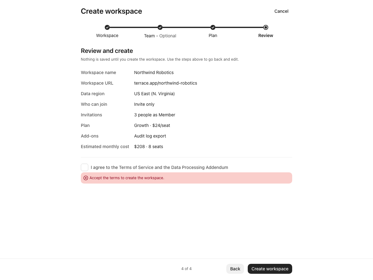
| Case | Focus lands on | Announced |
|---|---|---|
| Step 1, name blank | Workspace name | "Enter a name for the workspace." |
| Step 1, name fixed / URL bad | Workspace URL | "Use lowercase letters, numbers, and hyphens…" |
| Step 4, terms unchecked | Terms checkbox | "Accept the terms to create the workspace." |
Each focused control reports aria-invalid="true" with the message wired through aria-describedby, and all three scroll into view. Valid steps still advance. No console errors.
Ordering needs no separate list: validate records each step's problems in field order, so the first key is the first thing on the page to fix.

 xinzi-bot
left a comment
xinzi-bot
left a comment
xinzi-bot
left a comment
There was a problem hiding this comment.
Thanks—the focus-on-error update is good. One validation gap remains: leaving a broken step backward does not mark it attempted. Review can then hide that error, and the final handler checks only the current step. Please make the validation state cover every path through the Stepper.
[Automated review]

 cixzhang
left a comment
cixzhang
left a comment
cixzhang
left a comment
There was a problem hiding this comment.
Thanks—the focused-error path works: the field receives focus with aria-invalid and its error description. Three blockers remain:
- The wizard has no authoritative completion path. Moving backward from an invalid Plan, then jumping to Review, hides the error; Create checks only Review. There is also no
<form>/submit path, so Enter and Create submit nothing, while Cancel is inert. - The Plan picker exposes independent checkboxes under an unassociated label, not one labeled single-choice group. Price formatting also follows the browser locale instead of Astryx’s provider locale.
- At 320px, “2 of 4” overlaps Back by 13.8px in both LTR and RTL.
Please make every allowed path preserve whole-wizard validity, use native form/group semantics, provider-backed formatting, and a collision-free 320px footer.
[Reviewed by Robohands]

* feat(templates): add the form wizard page template

A linear multi-step form: one panel at a time, a horizontal progress track
pinned in the header so it never scrolls away, and per-step validation that
gates each advance while letting people move backward freely.

Validation is a pure function of the field values, so one rule set gates the
Next button, tints the stepper, and fills the review step's issue list — there
is no second copy of the rules to drift. Errors stay silent until a step has
been attempted, so an untouched field is never pre-flagged.

The footer carries three zones: Skip on the far edge for the one optional step,
the step counter centred, and Back/Next together. Skip is not Next with another
label — it clears what the optional step collects rather than letting a
half-filled step ride along invisibly.

Audited at 97/100 (grade A) under template rubric 1.3. The three points are the
one custom declaration, a zero flex basis on the footer's end zones, which is
what holds the counter on the centre line when the primary button's label grows
on the last step. StackItem exposes flex-grow but not basis, so there is no
component prop to use instead.

Co-authored-by: Cursor <cursoragent@cursor.com>

* fix(templates): answer a blocked Next with focus, not a footer summary

The footer carried a count of how many problems were above, which was a second
copy of a message every offending field was already showing and never said
which field. Pressing Next on a blocked step now sends focus to the first field
that needs attention instead: the browser scrolls it into view, and the error
the field is already rendering is its accessible description, so a screen
reader hears exactly which field and why rather than a number.

That frees the footer's centre slot, so the step counter is visible at every
moment rather than being displaced whenever a step is blocked.

`validate` records each step's problems in the order the fields appear, so the
first key is the first thing on the page to fix — no second ordering to keep in
sync with the form.

Considered showing the summary as a toast and rejected it: Toast's own docs say
not to use toasts for form validation errors, and to prefer inline validation
so the user can see exactly which field needs fixing. This is that.

Co-authored-by: Cursor <cursoragent@cursor.com>

* chore: fix PR #5664 release metadata

---------

Co-authored-by: Cursor <cursoragent@cursor.com>

3 participants


A linear multi-step form: one panel at a time, a horizontal progress track pinned in the header so it never scrolls away, and per-step validation that gates each advance while letting people move backward freely.
Stacked on #5659 — this template leans on the core Stepper collapsing itself in narrow containers rather than hand-rolling a fallback, so it should land after that one.
Why it is built this way
One rule set. Validation is a pure function of the field values, so the same
errorsobject gates the Next button, tints the stepper, and fills the review step's issue list. There is no second copy of the rules to drift. Errors stay silent until a step has been attempted, so an untouched field is never pre-flagged red.Backward movement is free.
onStepClickis passed unconditionally, so every step is reachable at any time. A wizard that locks you out of step 1 because step 3 is invalid turns a typo into a restart. Forward movement is still gated by the footer.Skip is not Next with another label. Next asserts the step is done and validates it; Skip declines the step outright and clears what it collects. A half-filled optional step riding along invisibly is the bug that button exists to prevent.
Screenshots
Radio list for the join policy, with the step counter centred in the footer:
Skip appears only on the one optional step, at the far edge from the button it would otherwise compete with:
The running total is a muted card — the consequence of every control above it, so it reads as its own object:
Review reads top to bottom in one column, against the steps that produced it:
When a step is blocked, the error takes the centre slot rather than the counter. They never need to be read at the same time, and the header stepper is still showing position:
A step left broken stays flagged, and the review step surfaces it rather than letting it hide behind a panel:
At 420px the core Stepper collapses itself and the footer holds its three zones:
Audit
97/100, grade A, under template rubric 1.3.
The three points are one custom declaration: a zero flex basis on the footer's two end zones. That is what holds the counter on the centre line when the primary button's label grows from "Next" to "Create workspace" on the last step — measured at 0px offset on every step.
StackItemexposes flex-grow but not basis, so there is no component prop to use instead.Test plan
Made with Cursor