[EuiButtonGroup] Implement redesign #3 - Selection variant - #9929
Conversation


0d4ae63 to
a8a9056
Compare

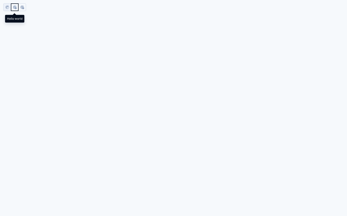
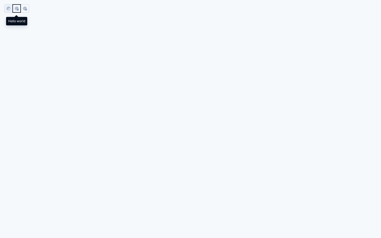
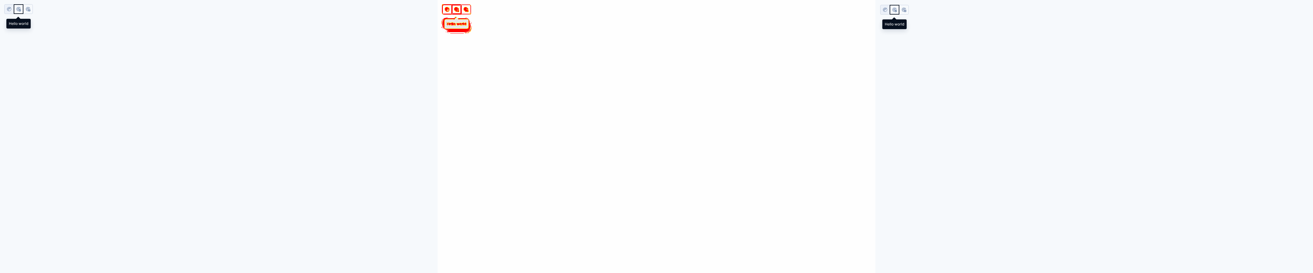
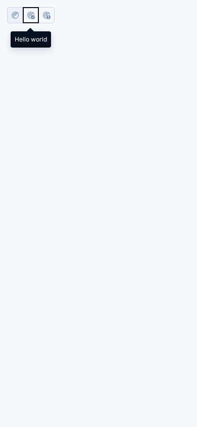
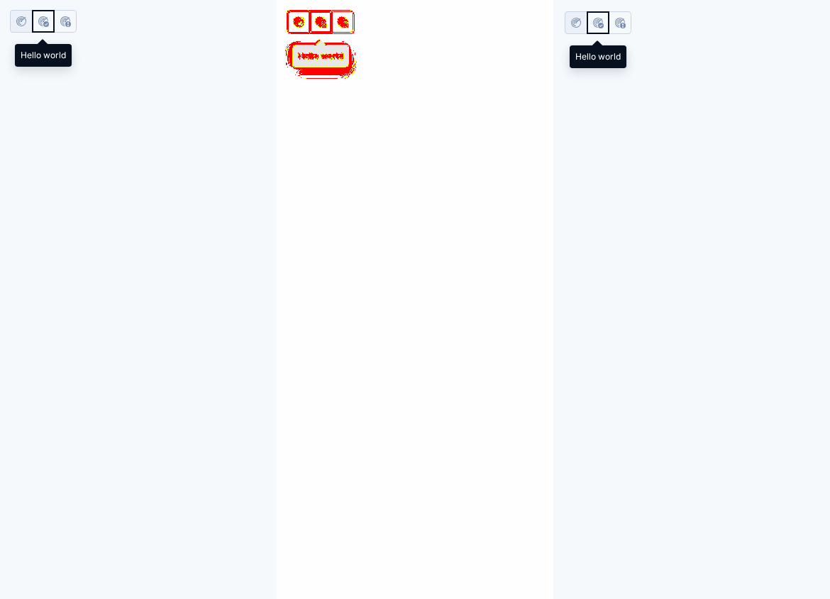
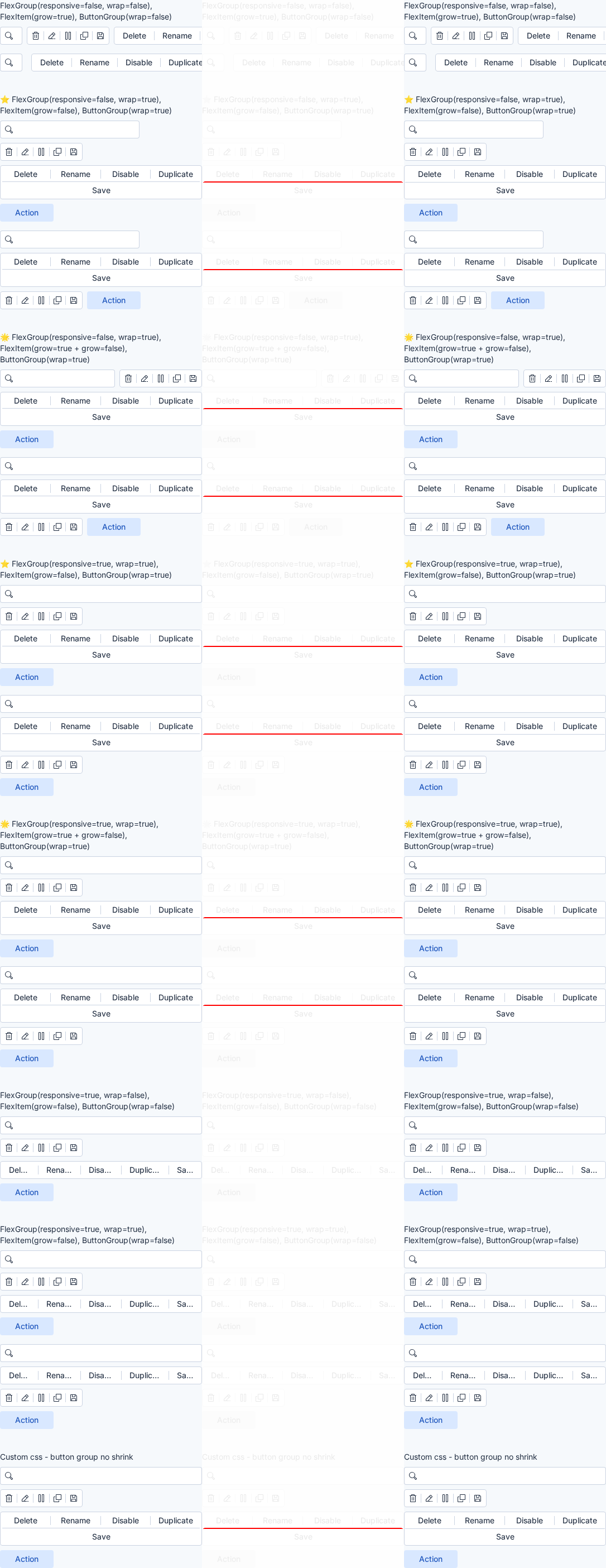
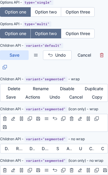
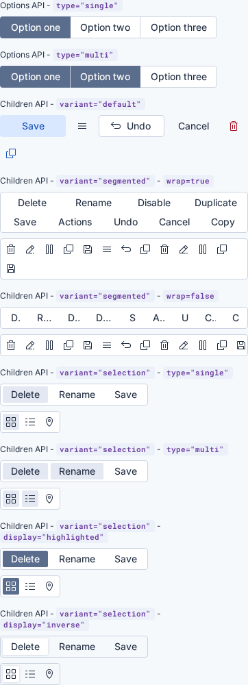
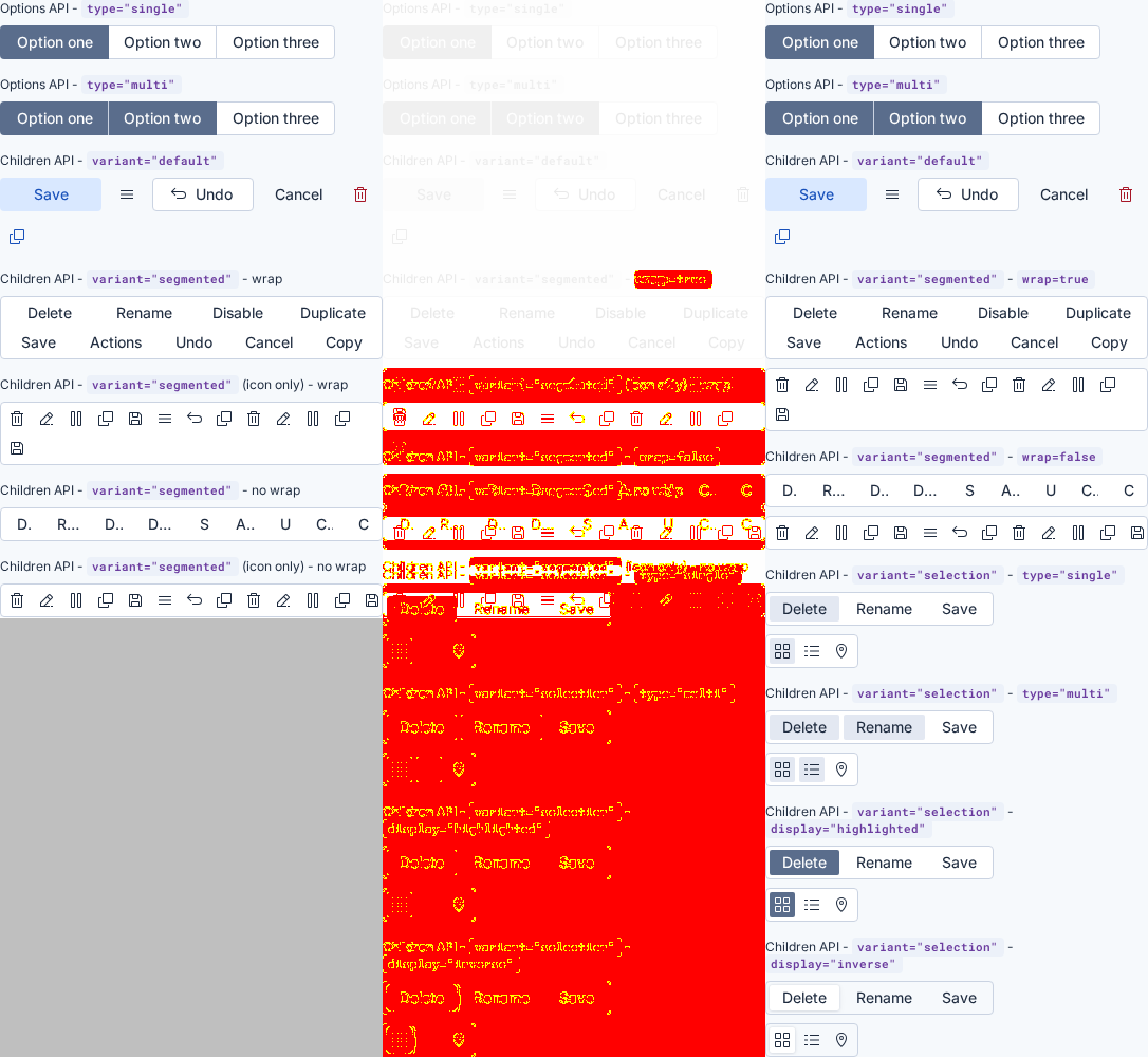
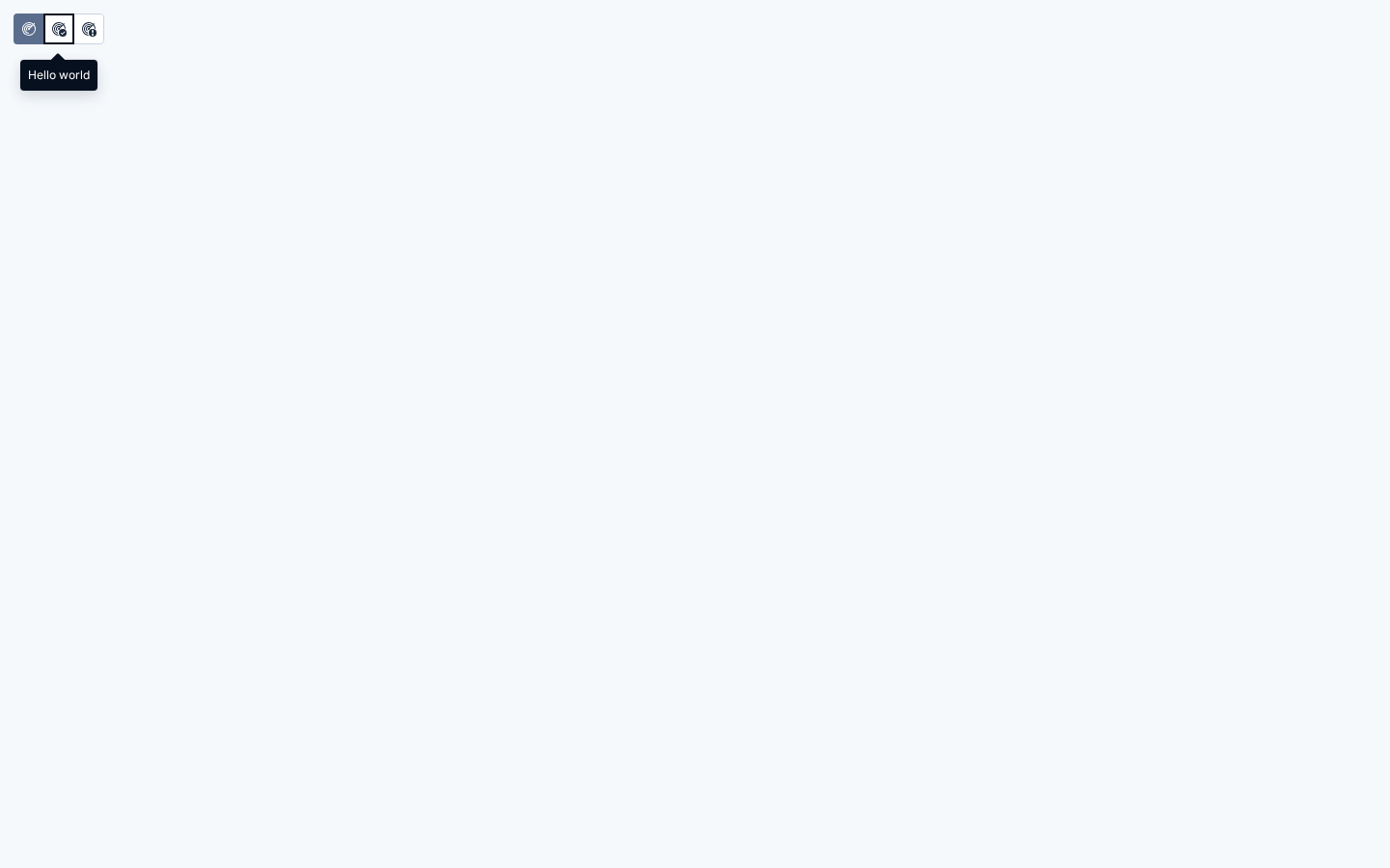
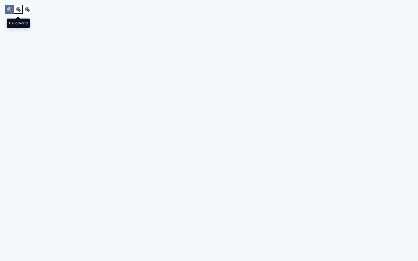
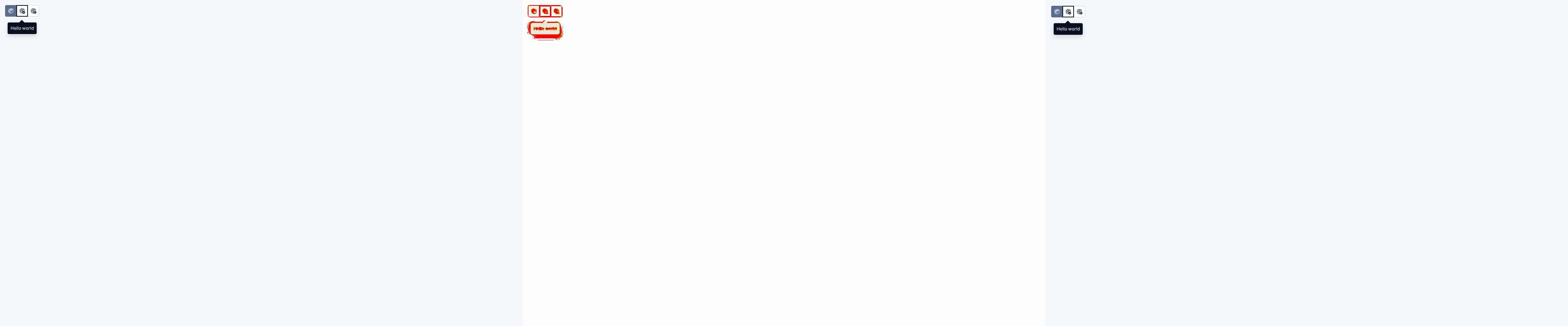
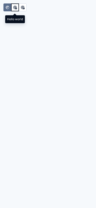
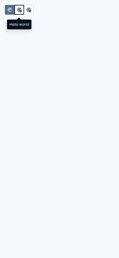
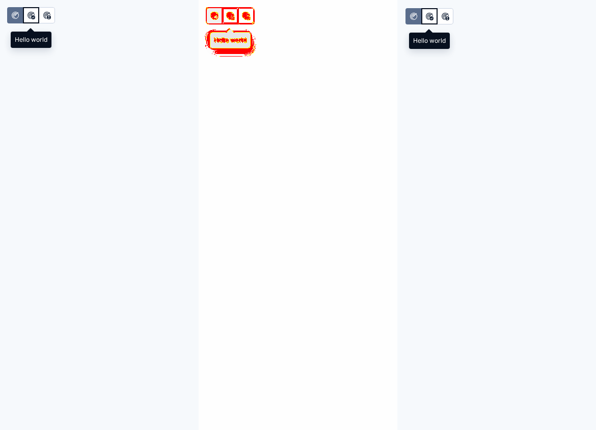
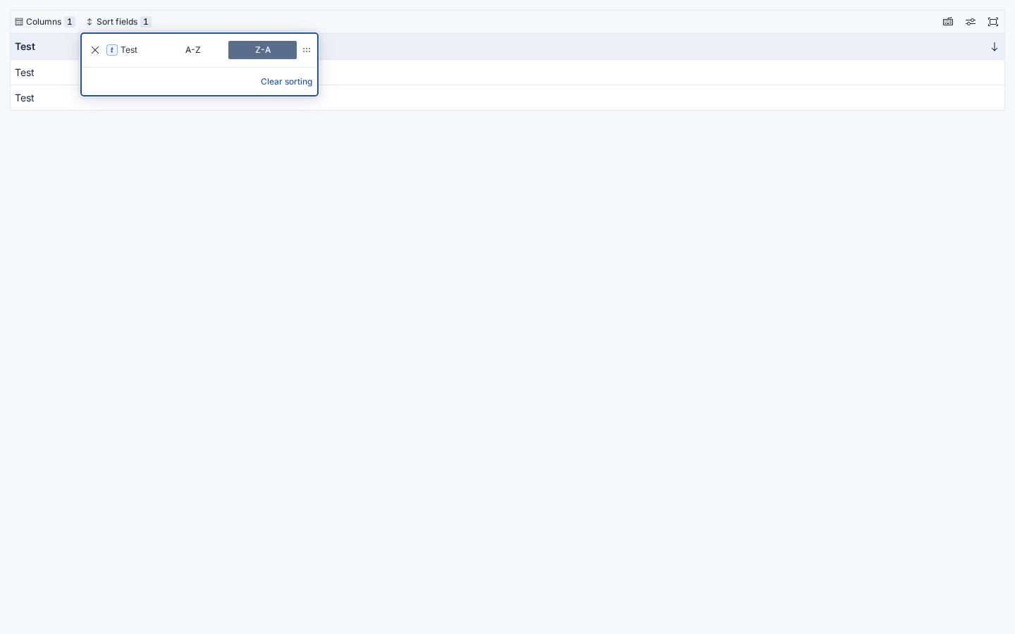
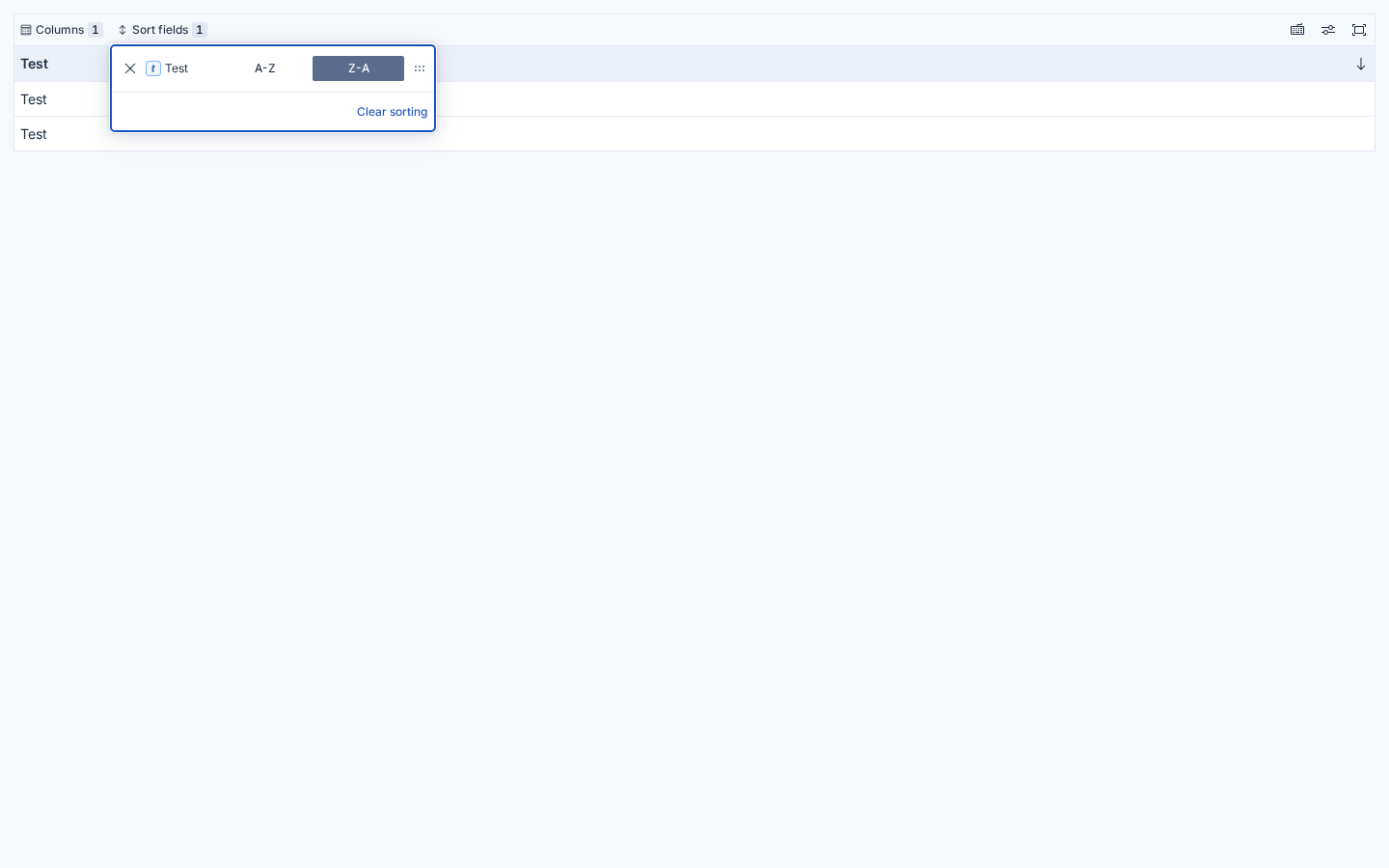
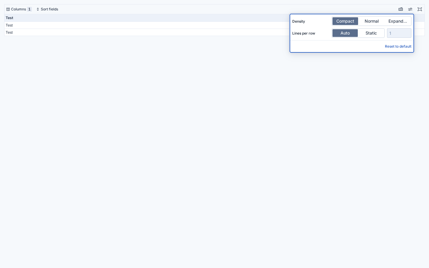
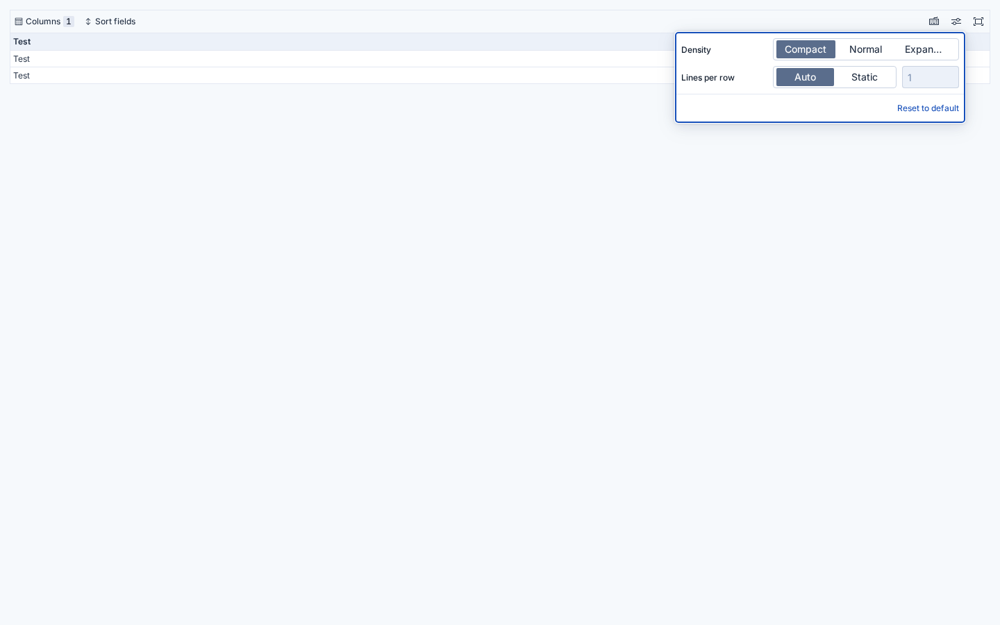
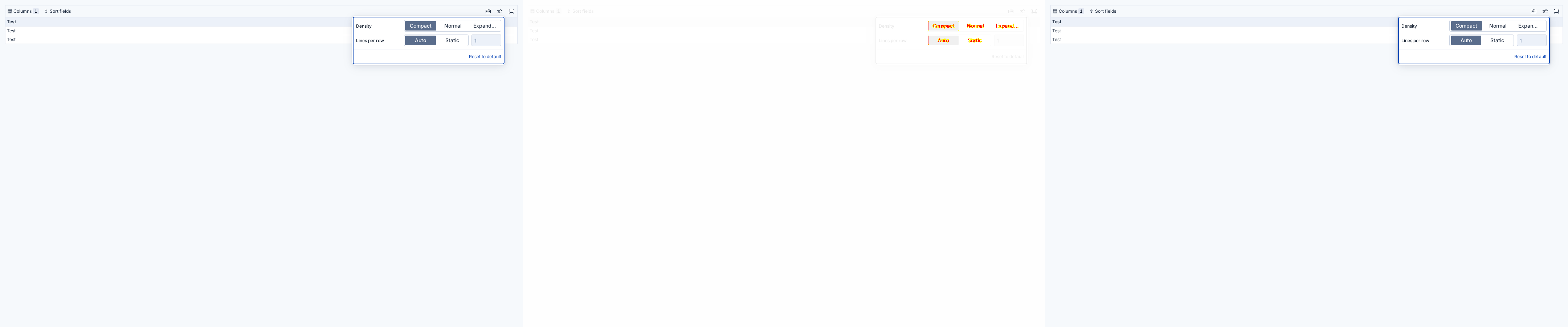
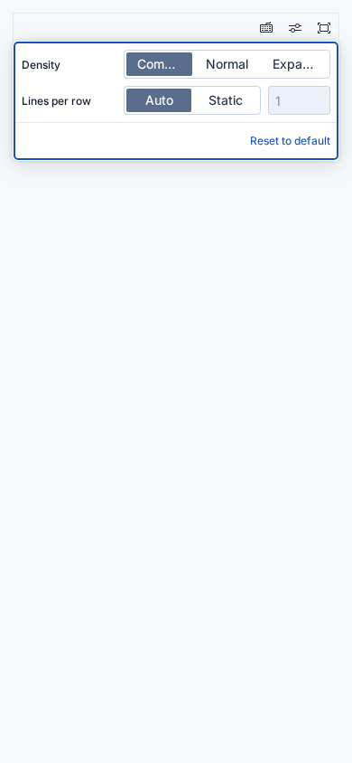
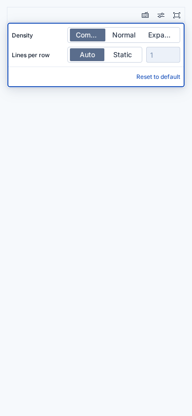
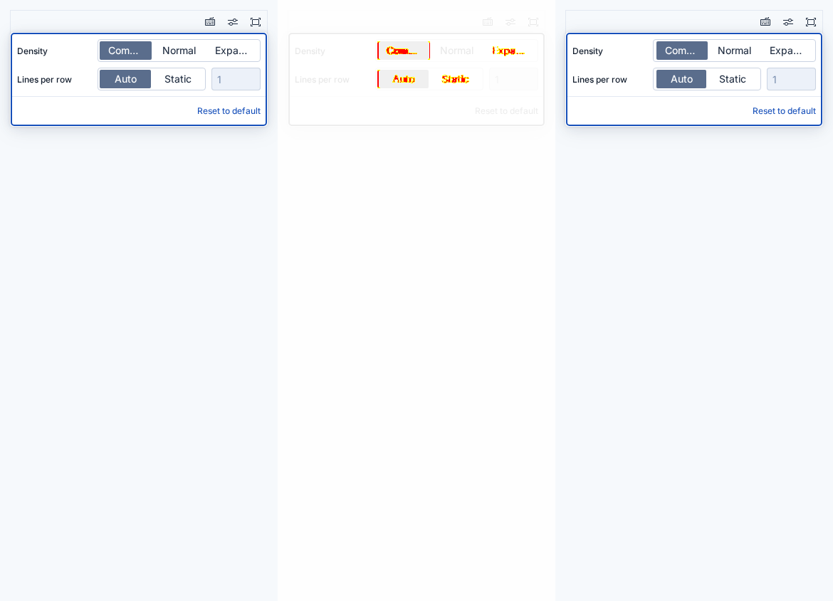
📷 32 visual difference(s) foundLook at the visual diff below. If everything is expected, run Approve visual changes to update baselines, re-run the job or make appropriate fixes. See the visual regression testing wiki for more information. Expand to revieweuisuperdatepicker (6 differences)
euibuttongroup (22 differences)
euidatagrid (4 differences)
|


























































b86ceff to
e25a064
Compare
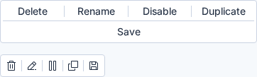
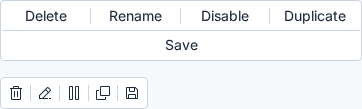
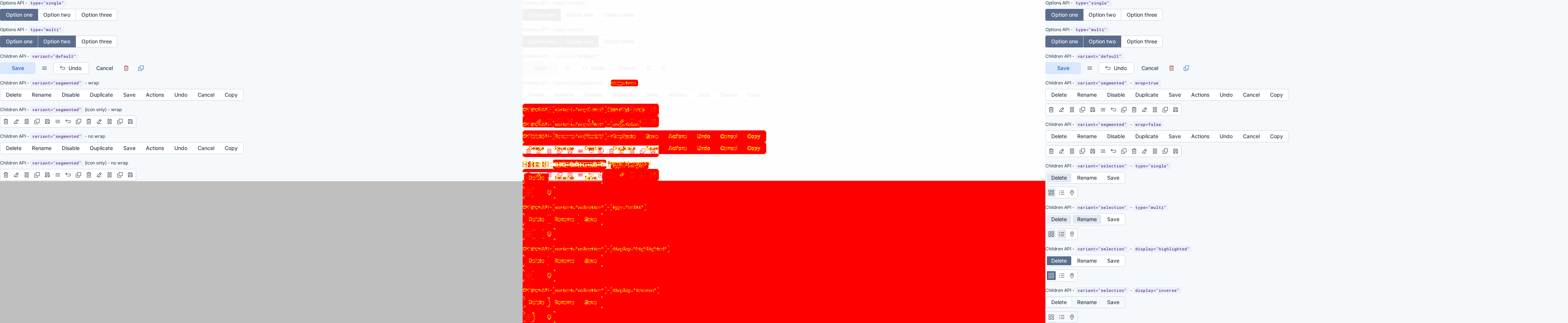
📷 6 visual difference(s) foundLook at the visual diff below. If everything is expected, run Approve visual changes to update baselines, re-run the job or make appropriate fixes. See the visual regression testing wiki for more information. Expand to revieweuibuttongroup (6 differences)
|


9f63c7b to
39df269
Compare
There was a problem hiding this comment.
Pull request overview
Adds the new variant="selection" to EuiButtonGroup’s Children API as part of the ongoing ButtonGroup redesign, including controlled single/multi selection behavior and updated visuals/semantics.
Changes:
- Implemented selection-group behavior via context wiring + a new
useEuiButtonGroupSelectionhook, includingaria-pressedsemantics. - Added/updated styling, Storybook stories, docs, and Jest coverage for the new selection variant.
- Exported the Children API props type and added a changelog entry.
Reviewed changes
Copilot reviewed 13 out of 23 changed files in this pull request and generated 4 comments.
Show a summary per file
| File | Description |
|---|---|
| packages/website/docs/components/navigation/buttons/group.mdx | Documents variant="selection" usage and provides interactive examples |
| packages/release-cli/kibana-prep-commits | Adds Kibana commit reference for integration prep |
| packages/eui/src/components/button/use_button_common_props.ts | Wires selection props + merged click handling via button context |
| packages/eui/src/components/button/index.ts | Exports EuiButtonGroupChildrenProps type |
| packages/eui/src/components/button/button.tsx | Passes selection-derived props into EuiButtonDisplay |
| packages/eui/src/components/button/button_icon/button_icon.tsx | Enables selection wiring for EuiButtonIcon (id/onClick/isSelected) |
| packages/eui/src/components/button/button_group/use_button_group_selection.ts | Adds controlled selection helper hook for selection variant |
| packages/eui/src/components/button/button_group/button_group.tsx | Introduces selection variant props + context-driven selection behavior |
| packages/eui/src/components/button/button_group/button_group.test.tsx | Adds Jest coverage for selection variant behavior/attributes |
| packages/eui/src/components/button/button_group/button_group.styles.ts | Adds selection styling (including display variants + HCM handling) |
| packages/eui/src/components/button/button_group/button_group_children.stories.tsx | Adds selection stories and KitchenSink examples |
| packages/eui/src/components/button/button_context.tsx | Extends context with getSelectionProps for selection variant |
| packages/eui/changelogs/upcoming/9929.md | Changelog entry for the Children API selection variant additions |
Suppressed comments (7)
packages/eui/src/components/button/button_group/button_group_children.stories.tsx:818
- This multi-selection KitchenSink example reuses
delete/rename/saveIDs that appear in other rendered selection examples, creating duplicate DOM IDs. Prefix these IDs (and theidToSelectedMapkeys) per example.
              <StatefulButtonGroupSelection
                {...commonProps}
                variant="selection"
                buttonSize={buttonSizeChildren}
                gutterSize={gutterSize}
                type="multi"
packages/eui/src/components/button/button_group/button_group_children.stories.tsx:874
- This highlighted-display KitchenSink example reuses
delete/rename/saveIDs that appear in other rendered selection examples, creating duplicate DOM IDs. Prefix these IDs (and theidToSelectedMapkeys) per example.
              <StatefulButtonGroupSelection
                {...commonProps}
                variant="selection"
                buttonSize={buttonSizeChildren}
                gutterSize={gutterSize}
                type="multi"
packages/eui/src/components/button/button_group/button_group_children.stories.tsx:932
- This inverse-display KitchenSink example reuses
delete/rename/saveIDs that appear in other rendered selection examples, creating duplicate DOM IDs. Prefix these IDs (and theidToSelectedMapkeys) per example.
              <StatefulButtonGroupSelection
                {...commonProps}
                variant="selection"
                buttonSize={buttonSizeChildren}
                gutterSize={gutterSize}
                type="multi"
packages/eui/src/components/button/button_group/button_group_children.stories.tsx:836
- This multi-selection icon example reuses
grid/list/mapIDs that also appear in other selection examples rendered on the same KitchenSink page. Prefix these IDs (andidToSelectedMapkeys) per example to avoid duplicate DOM IDs.
                type="multi"
                idToSelectedMap={{ grid: true, list: true }}
              >
                <EuiToolTip content="Grid view" disableScreenReaderOutput>
                  <EuiButtonIcon
                    id="grid"
packages/eui/src/components/button/button_group/button_group_children.stories.tsx:780
- This KitchenSink section reuses
grid/list/mapIDs that also appear in other selection examples below, resulting in duplicate DOMidattributes on the same page. Prefix these IDs per example to keep them globally unique.
                idSelected="grid"
              >
                <EuiToolTip content="Grid view" disableScreenReaderOutput>
                  <EuiButtonIcon
                    id="grid"
packages/eui/src/components/button/button_group/button_group_children.stories.tsx:894
- This highlighted-display icon example reuses
grid/list/mapIDs that appear in other selection examples rendered on the same KitchenSink page. Prefix these IDs (andidToSelectedMapkeys) per example to avoid duplicate DOM IDs.
                idToSelectedMap={{ grid: true }}
                display="highlighted"
              >
                <EuiToolTip content="Grid view" disableScreenReaderOutput>
                  <EuiButtonIcon
                    id="grid"
packages/eui/src/components/button/button_group/button_group_children.stories.tsx:952
- This inverse-display icon example reuses
grid/list/mapIDs that appear in other selection examples rendered on the same KitchenSink page. Prefix these IDs (andidToSelectedMapkeys) per example to avoid duplicate DOM IDs.
                idToSelectedMap={{ grid: true }}
                display="inverse"
              >
                <EuiToolTip content="Grid view" disableScreenReaderOutput>
                  <EuiButtonIcon
                    id="grid"
💡 Add a code-review agent skill or configure MCP servers for context-aware, tailored reviews. Learn more in the docs.


|
Great progress Lene. We should change the disabled state to perform like the regular disable state with
|


Thanks! Yes the disabled background change is already included 👍 |

 weronikaolejniczak
left a comment
weronikaolejniczak
left a comment
weronikaolejniczak
left a comment
There was a problem hiding this comment.
Blocking:
- I think there's a type hole because I can do:
<EuiButtonGroup
  legend="Actions"
  variant="segmented"
  display="highlighted"
  idSelected="save"
  onChange={(id) => {}}
>
which is undesired API (?). We should discriminate on variant.
- Docs and JSDoc say some props are
segmented-only but now they also apply toselection:showDividers,layout,wrap. E.g.:
EuiButtonEmptyisn’t wired forselection. Should we wire it or report just like we do for the segmented variant?
Non-blocking:
- Every child has to have a valid
idbut we cannot enforce that through types. Maybe we should add a dev warning at least? Or maybe... extend the existing lint rule: #9890? I prefer warnings in IDE and I think this case is statically parseable.
<EuiButtonGroup
  legend="Actions"
  variant="segmented"
  display="highlighted"
  idSelected="save"
  onChange={(id) => {}}
>
You're absolutely right, thanks for the catch! That should not be possible.
Ah good catch, the JSDoc is wrong. Updated in 5c30de2
That being said, we will still need to update the eslint rule to include
Yes, that was my plan to add an eslint rule for it 👍 |
💚 Build Succeeded
History
cc @mgadewoll |
💚 Build Succeeded
History
cc @mgadewoll |


Summary
Note
This PR is part 3 of implementing a new button group design and API.
It builds on the segmented variant added in part 2.
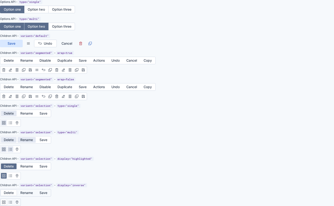
variant="selection"toEuiButtonGroupwith the new Children API.variant="selection"which renders the group as a visually connected toggle control witharia-pressedsemantics per buttontypeprop ('single' | 'multi') to switch between single or multi selection (same as existing Options API)idSelectedprop for single-state selection (same as existing Options API)idToSelectedMapprop for multi-state selection (same as existing Options API)onChangeprop (same as existing Options API)displayprop ('regular' | 'highlighted' | 'inverse') to render different visual variantsuseEuiButtonGroupSelectionhook for handling button group selectionNote
There will be another PR after this one that applies the new styles to the existing Options API button group and updates eui internal usages, effectively swapping over to the full redesign.
API Changes
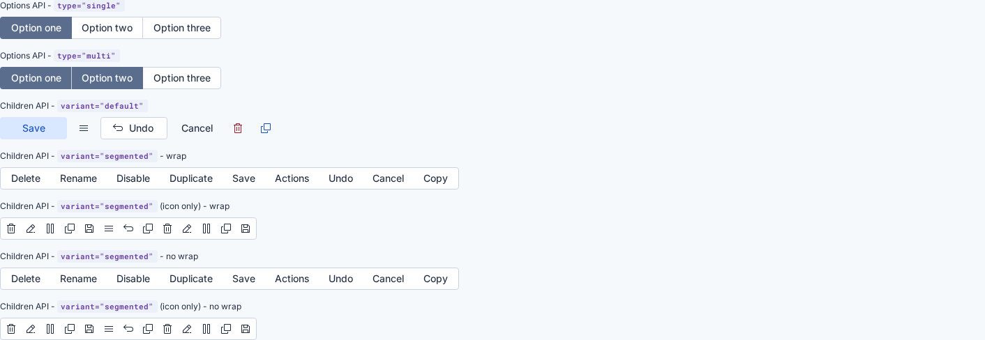
EuiButtonGroup(Children API)variantselectionvalue to support a selection button group similar to the legacy Options API.EuiButtonGroup(Children API)typeEuiButtonGroup(Children API)idSelectedEuiButtonGroup(Children API)idToSelectedMapEuiButtonGroup(Children API)onChangeidof the button.EuiButtonGroup(Children API)displayScreenshots
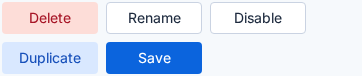
type="single"type="multi"display="highlighted"display="inverse"showDividers=trueisDisabled=trueHCM
display="regular"display="highlighted"display="inverse"Impact Assessment
Note: Most PRs should be tested in Kibana to help gauge their Impact before merging.
Impact level: 🟢 Low
🧪 The changes have been run in Kibana CI (🟢 build)
Requires Kibana changes: commits added here (snapshot update only)
Release Readiness
Migration guide: {steps or link, for breaking/visual changes or deprecations}Adoption plan (new features): {link to issue/doc or outline who will integrate this and where}QA instructions for reviewer
💻 Storybook
💻 Storybook kitchen sink
variant="selection"renders the component according to the new design specsvariant="selection"withtype="single"renders correctly and only one button is selected at a timevariant="selection"withtype="multi"allows multiple selections simultaneouslydisplay="regular",display="highlighted", anddisplay="inverse"render as expectedidSelectedcorrectly selects a single child button based on itsidand it applies only fortype="single"idToSelectedMapcorrectly selects multiple child buttons based on theiridand it applies only fortype="multi"aria-pressedis correctly set on selected/deselected buttonsisDisabledon the parent disables all childrenisDisabledcan be set on children individuallyEuiButtonGroupused with the Options APIvariant="default"andvariant="segmented"Checklist before marking Ready for Review
breaking changelabel (if applicable)Reviewer checklist