feat(core): let Stepper collapse itself in narrow containers - #5659
feat(core): let Stepper collapse itself in narrow containers#5659ernestt wants to merge 2 commits into
Conversation


A horizontal Stepper had no answer for narrow widths, so every consumer
hand-rolled the same fallback: a media query, a ProgressBar, and a line of
"Step 2 of 4" text standing in for the component. Four wizard templates
carried a version of it, each with its own breakpoint.

The Stepper now measures its own frame and collapses once a step has under
~112px to work with. Labels give way to a bare track and the current step is
named in a row beneath it, flanked by prev/next controls when `onStepClick`
makes them meaningful. Measuring the frame rather than the viewport means the
breakpoint follows the step count, so the collapse happens on the width the
stepper actually has rather than the width of the window around it.

The two indicator positions collapse differently, deliberately. `separated`
gives up its click targets with its labels, since all that would be left to
aim at is a 4px bar; the paired controls become the way through. `on-track`
keeps its indicators as a row of pressable nodes on the rail, which is the
better affordance and costs nothing to leave in place.

Steps register with the parent to report the count, and the active step
portals its own summary into a slot the Stepper provides, so none of this
needs child introspection. For screen readers the ordered list stays whole at
every width: collapsed steps keep visually hidden names, so the sequence is
never silently shortened.

Also fixes two things the collapse work surfaced. Step labels now hold to one
line and ellipsize instead of wrapping and breaking mid-word, which keeps a
row of steps at one height and the track under them straight; the full label
still reaches the accessible name. And the gap between connector segments is
now --spacing-1, matching the connector's own thickness, so the track reads
as one dashed line at any theme scale.

Co-authored-by: Cursor <cursoragent@cursor.com>


|
The latest updates on your projects. Learn more about Vercel for GitHub.
|


 meta-cla
Bot
added
the
CLA Signed
meta-cla
Bot
added
the
CLA Signed
 github-actions
Bot
added
the
needs:code-review
github-actions
Bot
added
the
needs:code-review


PR Analysis Report📚 Storybook PreviewView Storybook for this PR 🧪 Sandbox PreviewView Sandbox for this PR Modified ComponentsStepper (@astryxdesign/core) · View in Storybook
Bundle Size Summary
Accessibility AuditStatus: 1 accessibility violation(s) found — 1 serious. Stepper - 1 issue(s)
Visual Regression2 of 406 shot(s) changed. View the report To accept these exact frames: A change here is a question, not a failure: check whether the after is the
Stepper — Default — neutral light
Stepper — Default — neutral dark
Generated by PR Enrichment workflow | Storybook | Sandbox | View full report |


The collapse work wraps the list in a frame and adds a summary row, both
carrying themeProps, but theming.targets never learned about them. Theme
authors and codegen read that array to discover which selectors exist, so
an undocumented class is an unthemeable element — which themingTargets
caught. Adds astryx-stepper-frame and astryx-stepper-summary to both the
English and Chinese target lists.

Co-authored-by: Cursor <cursoragent@cursor.com>

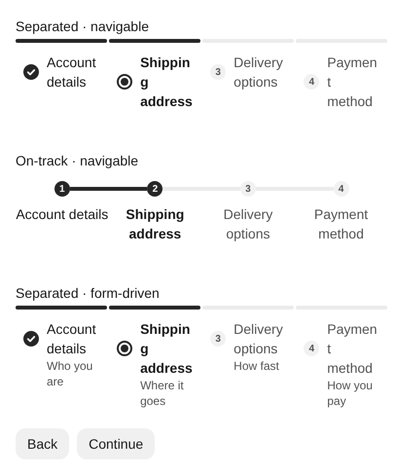
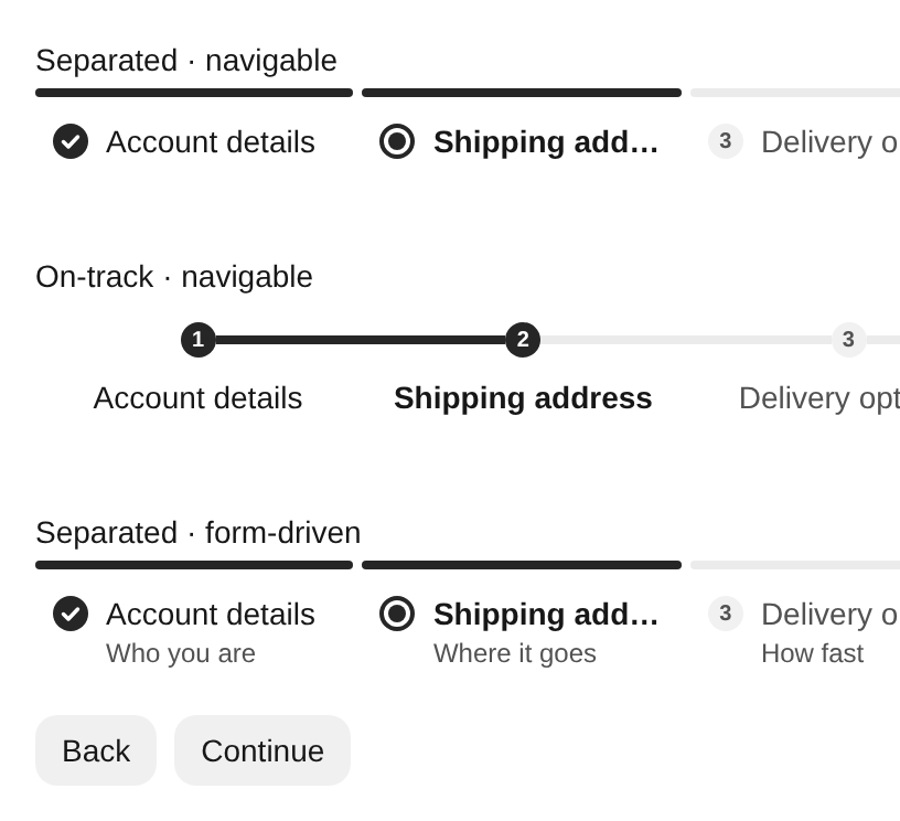
What this change fixes at narrow widthsI rendered the same 320px fixture on current
Scenario-by-scenario
This is the core value of the PR: consumers no longer need to replace a crowded horizontal Stepper with their own media-query + progress-bar fallback. The component adapts based on its actual container width and step count. |

|
/accept-visual 33198611074/1 4px segments the individual steps more clearly instead of one continuous line |
|
Visual acceptance could not be recorded. See this workflow run for the rejected invariant or infrastructure error. |
Changes suggested (non-maintainer review)The responsive collapse is the right idea, and the horizontal single-line improvement works. In a measured fixture, the uneven
Non-blocking follow-ups: long summary labels can overlap the chevron; The feature does not need redesigning, but these four cases warrant another revision before acceptance. |

 xinzi-bot
left a comment
xinzi-bot
left a comment
xinzi-bot
left a comment
There was a problem hiding this comment.
Automated review found three compact-mode contract regressions: resizing unmounts Step content and can lose state or focus; compact controls can select disabled steps; and responsive measurement reads a wrapper instead of the public styled root. Preserving content/state, disabled semantics, and root sizing would keep existing contracts.
[Automated review]

2 participants


Summary
A horizontal
Stepperhad no answer for narrow widths, so every consumer hand-rolled the same fallback: a media query, aProgressBar, and a line of "Step 2 of 4" text standing in for the component. Four wizard templates carried a version of it, each with its own breakpoint.The Stepper now measures its own frame and collapses once a step has under ~112px to work with. Labels give way to a bare track, and the current step is named in a row beneath it, flanked by prev/next controls when
onStepClickmakes them meaningful.Measuring the frame rather than the viewport means the breakpoint follows the step count, so a stepper collapses on the width it actually has rather than the width of the window around it. Four steps hold out to ~448px; seven need ~784px.
The two indicator positions collapse differently, deliberately.
separatedgives up its click targets along with its labels, since all that would be left to aim at is a 4px bar — the paired controls become the way through.on-trackkeeps its indicators as a row of pressable nodes on the rail, which is the better affordance and costs nothing to leave in place.No child introspection. Steps register with the parent to report the count, and the active step portals its own summary into a slot the Stepper provides. Nothing reads
child.propsor walksChildren.The sequence stays whole for screen readers at every width — collapsed steps keep visually hidden names, so the ordered list is never silently shortened.
Two fixes the collapse work surfaced, folded in because they only matter here:
--spacing-1, matching the connector's own thickness, so the track reads as one dashed line at any theme scale.Scope
Core only. The wizard templates that motivated this still carry their hand-rolled fallbacks and are being cleaned up one PR per template. An unrelated
LayoutContentpadding fix in my working tree is deliberately left out.Test plan
pnpm -F @astryxdesign/core typecheckandpnpm -F @astryxdesign/storybook typecheckclean.Narrow — Collapsed Trackstory exercises all four cases side by side.Known gap, not addressed here
statusnever recolors the connector — progress is the bar's channel, status is the indicator's. That holds when every step shows an indicator, but collapsing removes indicators for every step except the current one, so an error on a step you have navigated away from is invisible while collapsed. In the labelled layout that step keeps its glyph. Worth a follow-up; I did not want to quietly break the channel separation to paper over it.Made with Cursor
Screenshots
Separated, wide — unchanged. Four labelled steps, icons as indicators.
Separated, 380px — collapsed. Labels and click targets gone, four bars left, the current step named underneath between two flat controls. Previous is disabled on step 1.
Separated, 380px — error on the current step. The summary carries the error glyph; Previous is now live.
On-track, wide.
On-track, 380px — collapsed differently, on purpose. The numbered nodes stay on the rail and stay pressable; all four remain hit-targets. Only the labels go.
Label truncation. Captured with deliberately long labels. Each holds one line and ellipsizes, so the row keeps one height and the track stays straight; short labels are untouched.